We look forward to showing you Velaris, but first we'd like to know a little bit about you.


Top 5 Customer Success Dashboard Examples and Best Practices
Explore the different types of Customer Success dashboards you can create for your business.
The Velaris Team
December 3, 2026
A Customer Success dashboard is a centralized, visual tool that consolidates and displays key metrics related to Customer Success.
It provides Customer Success managers (CSMs) with real-time insights into customer health, engagement, and satisfaction by aggregating data from various sources. This enables CSMs to monitor important indicators such as churn rates, customer lifetime value (CLV), and product usage metrics.
By presenting this information in an intuitive and accessible format, Customer Success dashboards facilitate data-driven decision-making, allowing businesses to proactively address customer issues, enhance satisfaction, and drive long-term success.
Key takeaways
- Customer Success dashboards centralize key metrics to help CSMs monitor customer health, engagement, and risk.
- Health dashboards identify at-risk accounts using health scores, usage trends, and churn signals, while onboarding dashboards track milestone progress to ensure customers reach value faster.
- Engagement dashboards reveal feature adoption patterns and opportunities to improve usage.
- Renewal and upsell dashboards highlight expansion opportunities and upcoming renewals, and support dashboards provide insight into ticket trends, resolution times, and customer satisfaction.
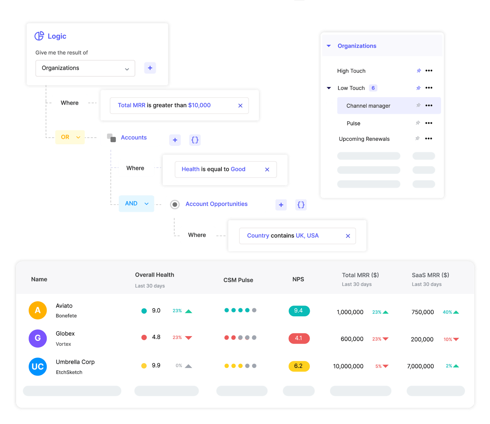
1. Customer health dashboard
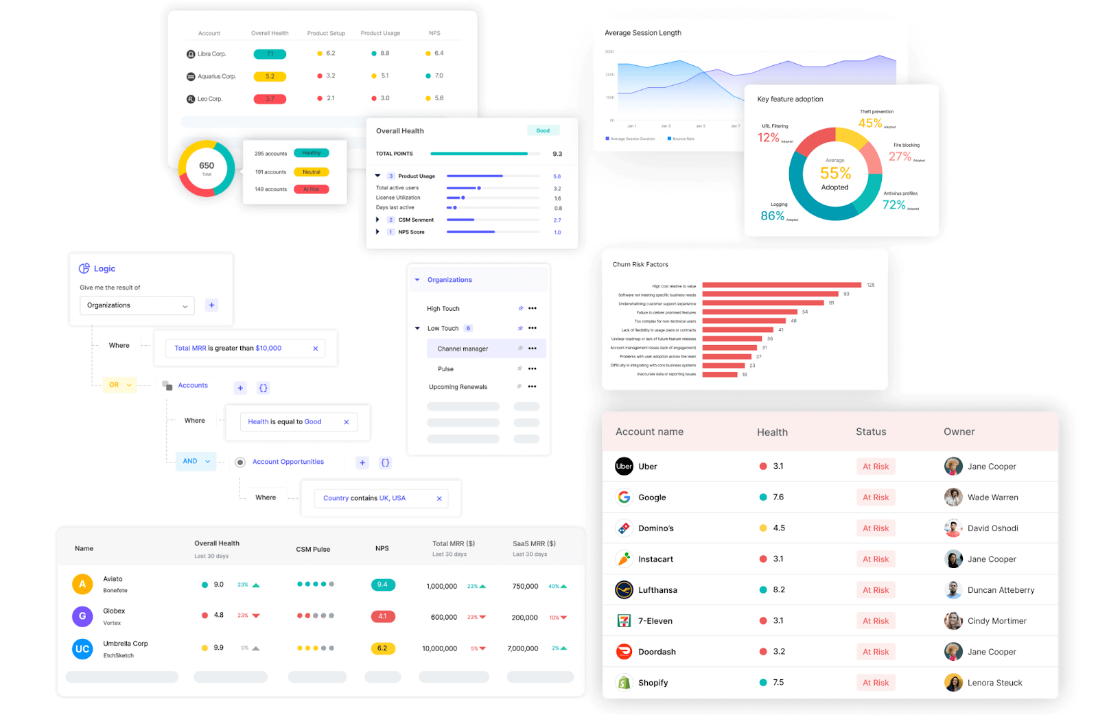
A Customer health dashboard is essential for monitoring the overall health of customer accounts, providing Customer Success Managers (CSMs) easy access to a holistic and real-time view of the customer base.
A good customer health dashboard includes the following elements:
- Health score indicator:
At the center of most customer health dashboards is the Customer Health Score, a composite metric that summarizes the overall status of an account. This score typically combines several data inputs such as product usage levels, engagement patterns, support history, and customer feedback.
For example, a health score may incorporate metrics like feature adoption rates, login frequency, support ticket volume, NPS responses, and recent sentiment signals from emails or calls.
To make the score easy to interpret, many dashboards display it with a color-coded system. Healthy accounts may appear in green, accounts showing early warning signs may appear in yellow, and customers at high risk of churn may appear in red.
This visual approach allows CSMs to scan their entire portfolio quickly and prioritize intervention where it matters most.
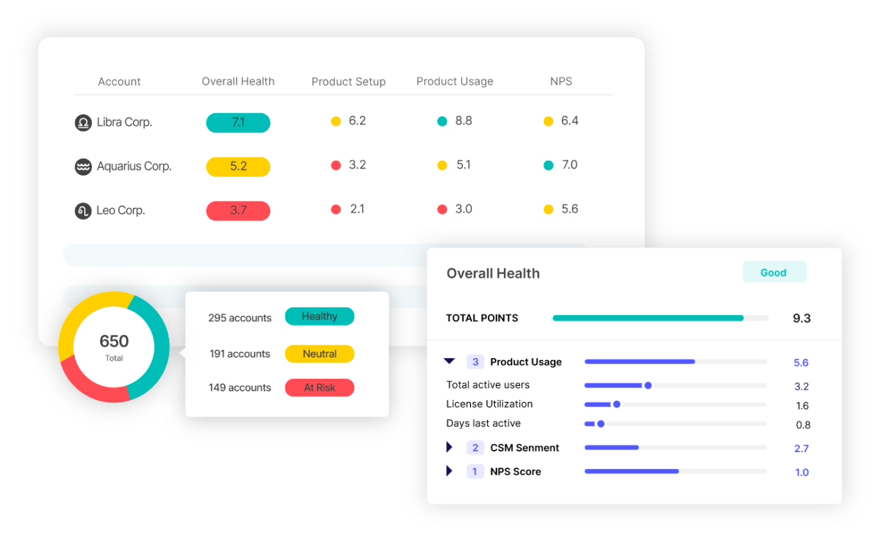
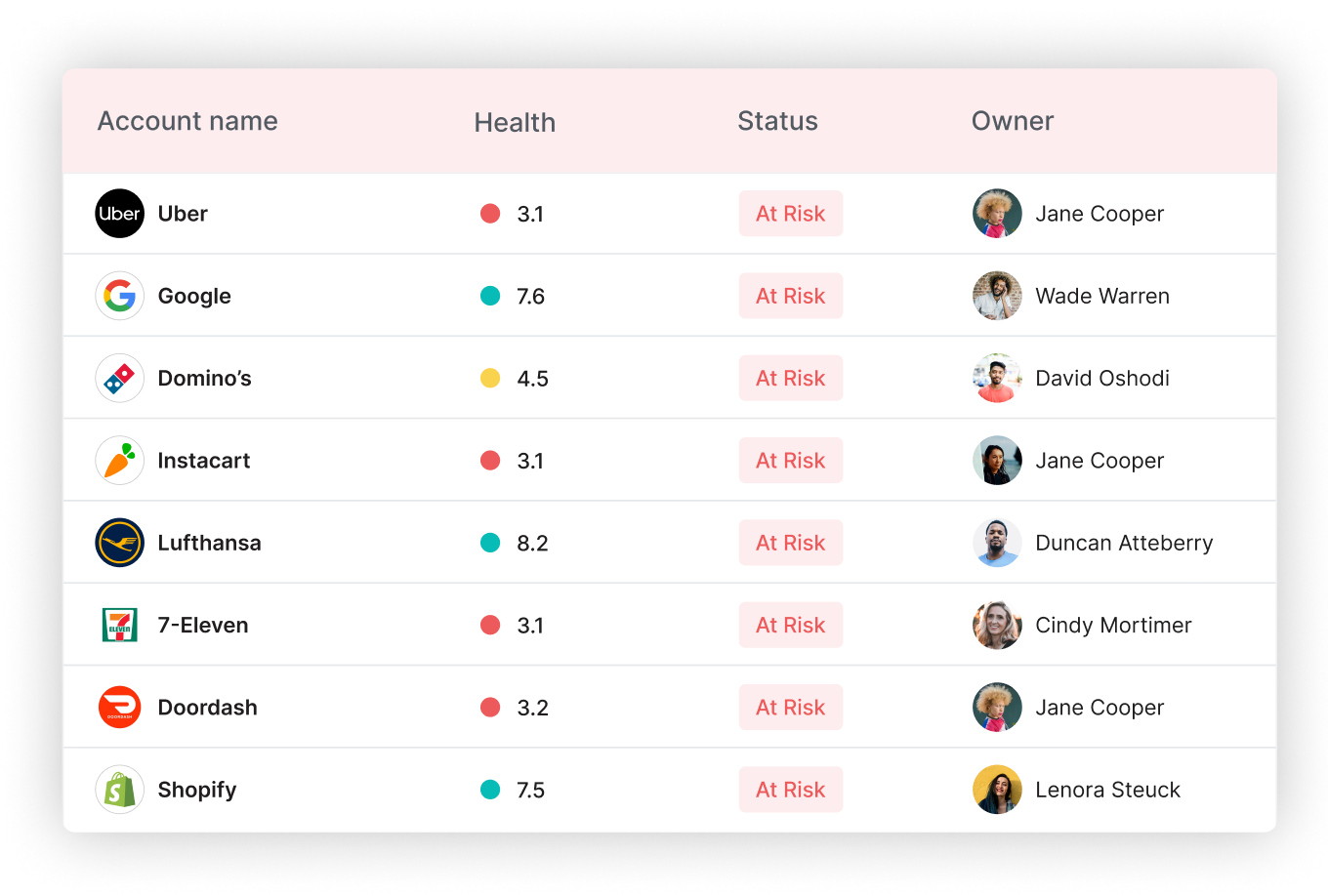
- Churn risk scoring:
A strong health dashboard goes beyond static health scores by incorporating churn risk scoring. This metric uses historical trends and behavioral signals to estimate the likelihood that a customer may churn in the near future.
Churn risk indicators often include signals such as declining product usage, reduced engagement with key features, repeated support escalations, or negative sentiment in communications.
By highlighting these risk factors early, Customer Success teams can identify struggling accounts before issues escalate into cancellations. This allows CSMs to proactively schedule check-ins, offer training, or address product concerns before the renewal stage.
- Usage trends:
Product usage data is one of the most reliable indicators of customer health. A Customer Health Dashboard typically visualizes usage patterns using line charts or bar graphs to track engagement over time.
Key metrics may include login frequency, active user counts, feature adoption rates, session duration, or completion of important product workflows. These trends help CSMs detect early signs of disengagement, such as a gradual drop in activity or underutilization of critical features.
When usage patterns decline, Customer Success teams can intervene with targeted education, feature walkthroughs, or strategic conversations to help customers unlock more value from the product.
- Customer segmentation table:
Another important component of a health dashboard is customer segmentation. Rather than reviewing accounts individually, the dashboard groups customers into meaningful cohorts based on attributes such as industry, ARR, lifecycle stage, or health score category.
This segmentation allows teams to quickly identify patterns across their customer base. For example, CSMs might notice that a particular segment of customers is struggling with onboarding or that high-value accounts show declining feature adoption.
With this level of visibility, teams can prioritize their efforts more effectively and focus their time on accounts with the highest risk or growth potential.
- Alerts and notifications:
To support proactive Customer Success, health dashboards often include automated alerts and notifications. These alerts trigger when specific thresholds are reached or when behavior signals suggest an emerging problem.
Examples might include a sudden drop in product usage, a spike in support tickets, negative customer sentiment, or a health score falling below a defined threshold.
Instead of manually monitoring every account, CSMs receive notifications that prompt immediate follow-up. This ensures that no critical changes in customer health go unnoticed.
Using these features of the Health Dashboard, CSMs can prioritize high-risk accounts and proactively take targeted action to improve outcomes.
Velaris, a highly rated software on G2, can help you create this dashboard by consolidating real-time data from product usage, customer interactions, and sentiment analysis. With Velaris’ customizable health scoring and predictive churn models, you can proactively identify at-risk accounts.
2. Onboarding progress dashboard
An Onboarding Progress Dashboard is indispensable for ensuring new customers are guided smoothly through the onboarding process. It helps Customer Success teams track how new customers move through the onboarding journey. T
The dashboard provides a clear view of which onboarding steps have been completed, where customers are stuck, and how long it typically takes accounts to reach first value.
This visibility is critical because onboarding delays often translate into slower product adoption and higher churn risk. When teams can see onboarding progress in real time, they can intervene early and ensure customers stay on track.
These components might be found on an onboarding progress dashboard:
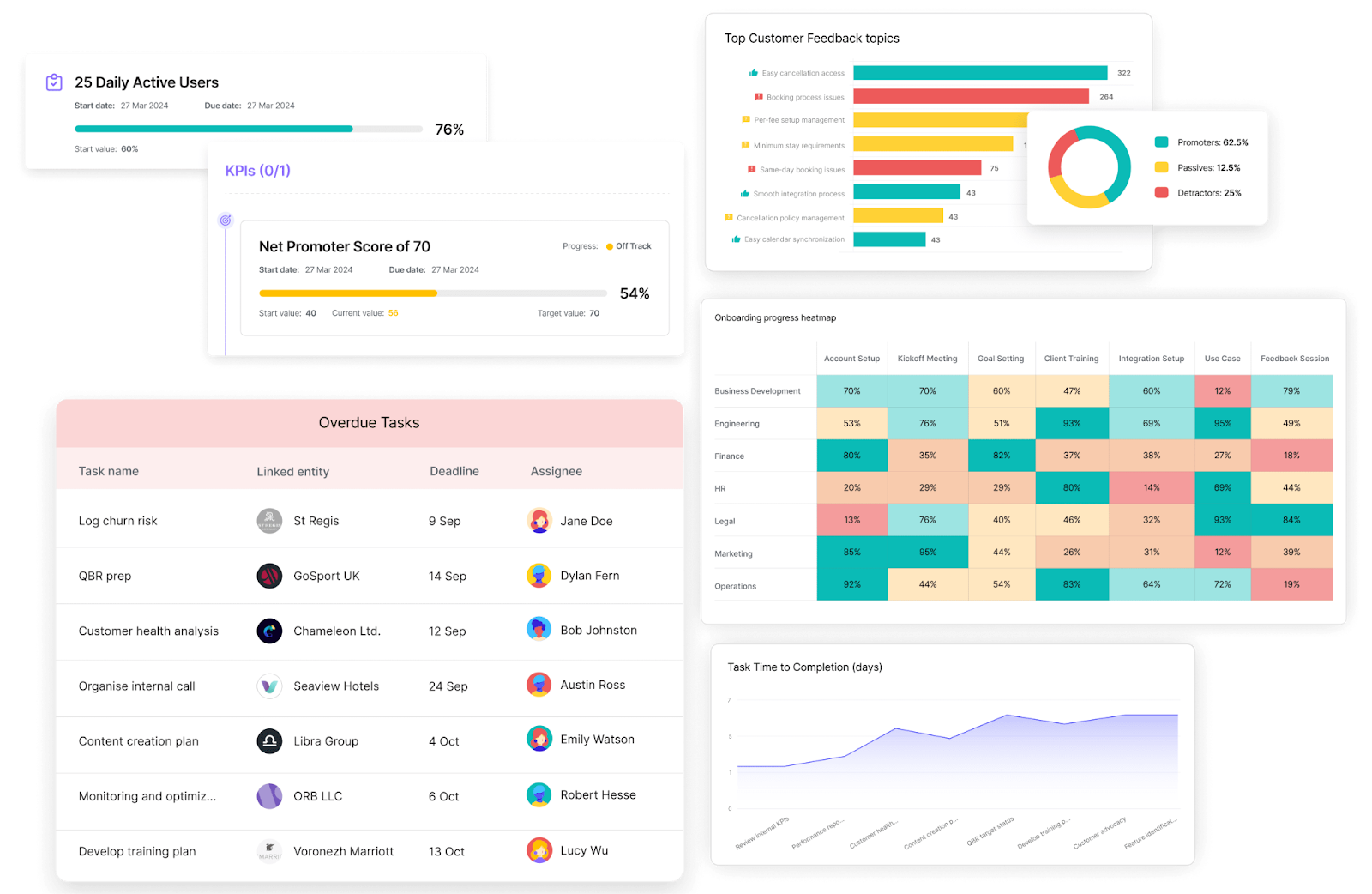
- Milestone completion tracker:
Most onboarding dashboards start with a milestone tracker that maps out the key stages customers must complete during onboarding. These milestones often include steps such as account setup, integration configuration, first login, initial product training, and activation of key features.
The dashboard typically visualizes these steps using progress bars, checklists, or percentage indicators that show how far each customer has progressed.
For example, a CSM might quickly see that a customer has completed account setup and training but has not yet activated a core feature. This level of clarity makes it easier to guide customers toward the actions that will unlock product value.
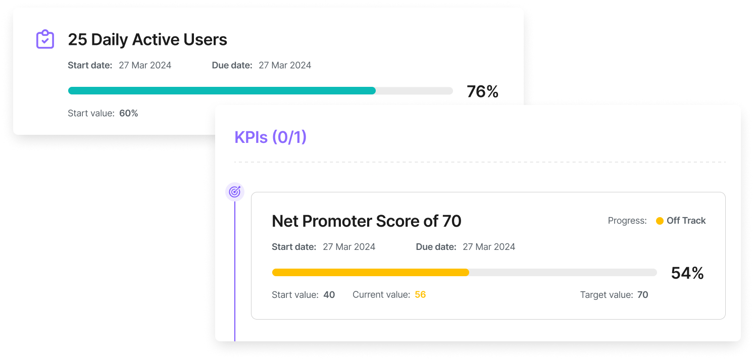
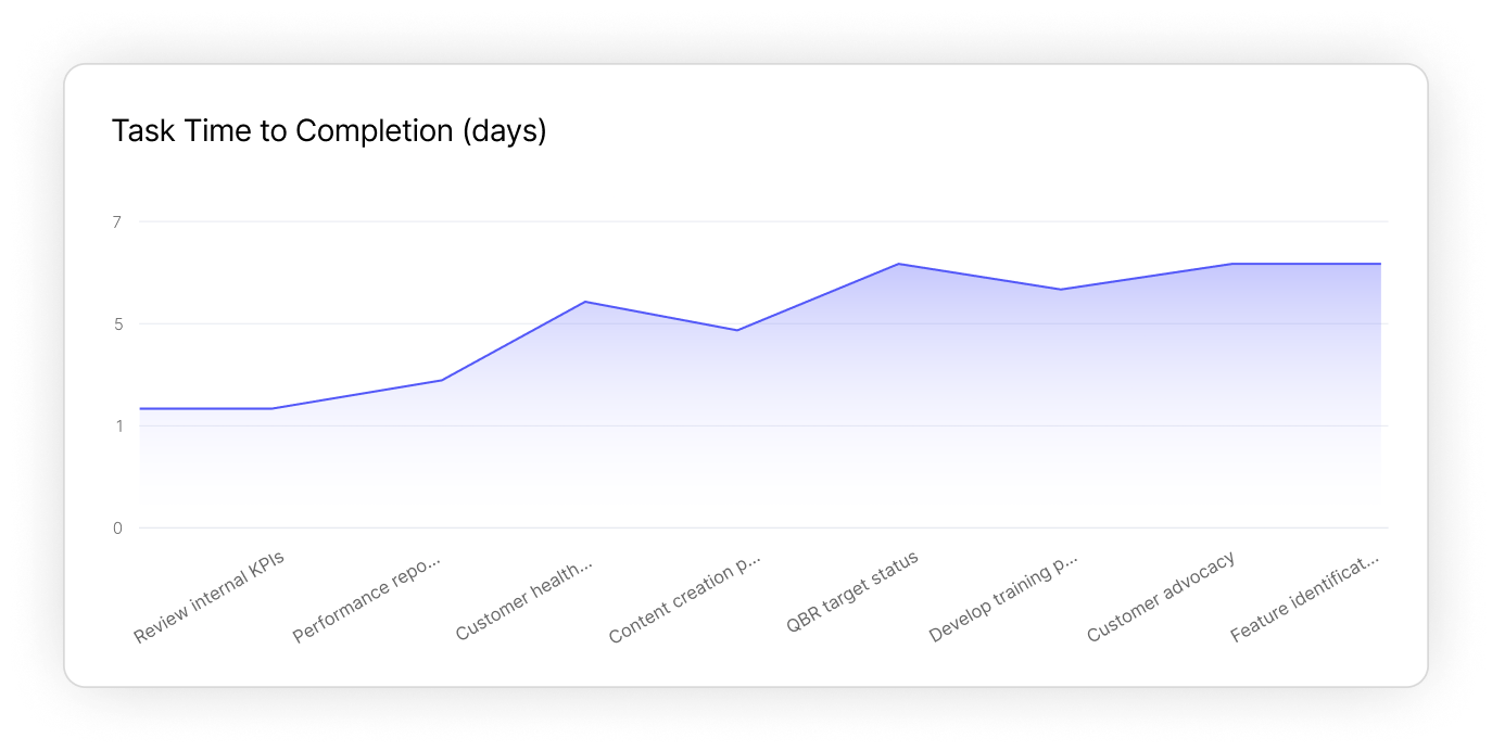
- Time-to-completion metrics:
Tracking how long onboarding steps take is just as important as tracking whether they are completed. An onboarding dashboard usually includes time-to-completion metrics that measure how quickly customers move through each milestone.
These metrics may include:
- Average time from contract signature to first login
- Time required to complete integration setup
- Time to first key feature activation
- Overall time-to-first-value
By visualizing this data in charts or tables, Customer Success teams can identify bottlenecks in the onboarding process. If many customers consistently take longer than expected to complete a specific step, it may indicate unclear documentation, technical friction, or insufficient onboarding guidance.
- Customer feedback scores:
Another valuable component of onboarding dashboards is customer feedback tracking. Collecting feedback at different points in the onboarding journey helps teams understand how customers experience the process.
This may include short onboarding surveys, milestone feedback forms, or sentiment signals captured from support interactions. Metrics such as onboarding CSAT scores or qualitative comments can reveal whether customers feel confident during setup or if they are encountering confusion.
When feedback is tied directly to onboarding stages, teams can quickly pinpoint where improvements are needed. For example, repeated negative feedback during integration setup might signal that documentation or implementation guidance needs refinement.
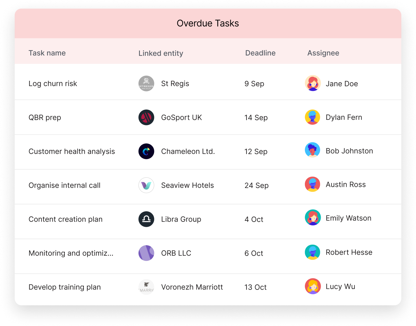
- Overdue tasks list:
A practical onboarding dashboard also highlights overdue tasks and stalled milestones. Instead of manually reviewing every account, CSMs can immediately see which customers have fallen behind schedule.
This section of the dashboard often includes a list of customers with incomplete onboarding tasks, along with contextual information such as account value, lifecycle stage, or churn risk level.
For instance, if a high-value customer has not completed product configuration within the expected timeline, the dashboard can flag this account for immediate follow-up. These alerts allow CSMs to prioritize outreach and prevent onboarding delays from escalating into long-term disengagement.
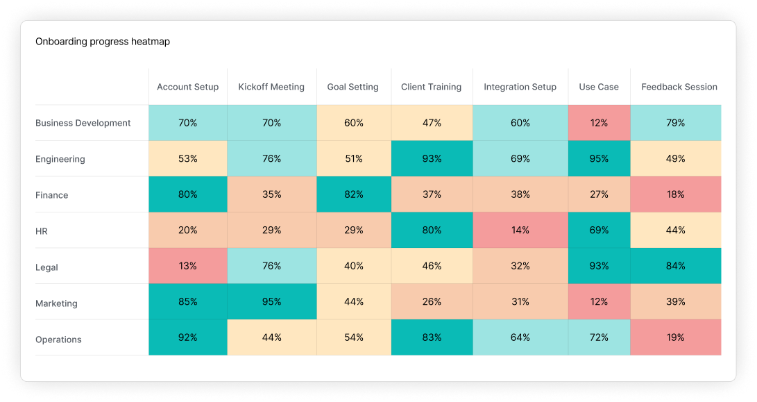
- Progress heatmap by segment:
In addition to tracking individual accounts, onboarding dashboards often provide segment-level insights. Visualizations such as heatmaps or cohort charts allow teams to analyze onboarding progress across different customer groups.
Teams might segment customers by industry, company size, product package, or region to understand how onboarding performance varies across the customer base.
For example, a heatmap might reveal that SMB customers complete onboarding quickly while enterprise accounts take significantly longer due to more complex integrations. These insights help teams adjust onboarding strategies to better match the needs of each segment.
The advantage of this dashboard is that you can quickly identify and address delays or inefficiencies in the onboarding workflow, setting a clear path toward successful onboarding completion.
You can track and visualize progress across onboarding milestones in real-time with Velaris. With features like task automation, milestone tracking, and customer sentiment integration, you can ensure that no customer falls behind.
3. Engagement and usage dashboard
An Engagement and Usage Dashboard helps Customer Success teams understand how customers are actually interacting with the product. While onboarding dashboards focus on initial activation, engagement dashboards reveal whether customers continue to use the platform regularly and whether they are adopting the features that drive long-term value.
Without visibility into engagement patterns, it becomes difficult to detect early signs of disengagement. A strong usage dashboard allows CSMs to monitor activity trends, identify adoption gaps, and intervene before declining engagement turns into churn risk.
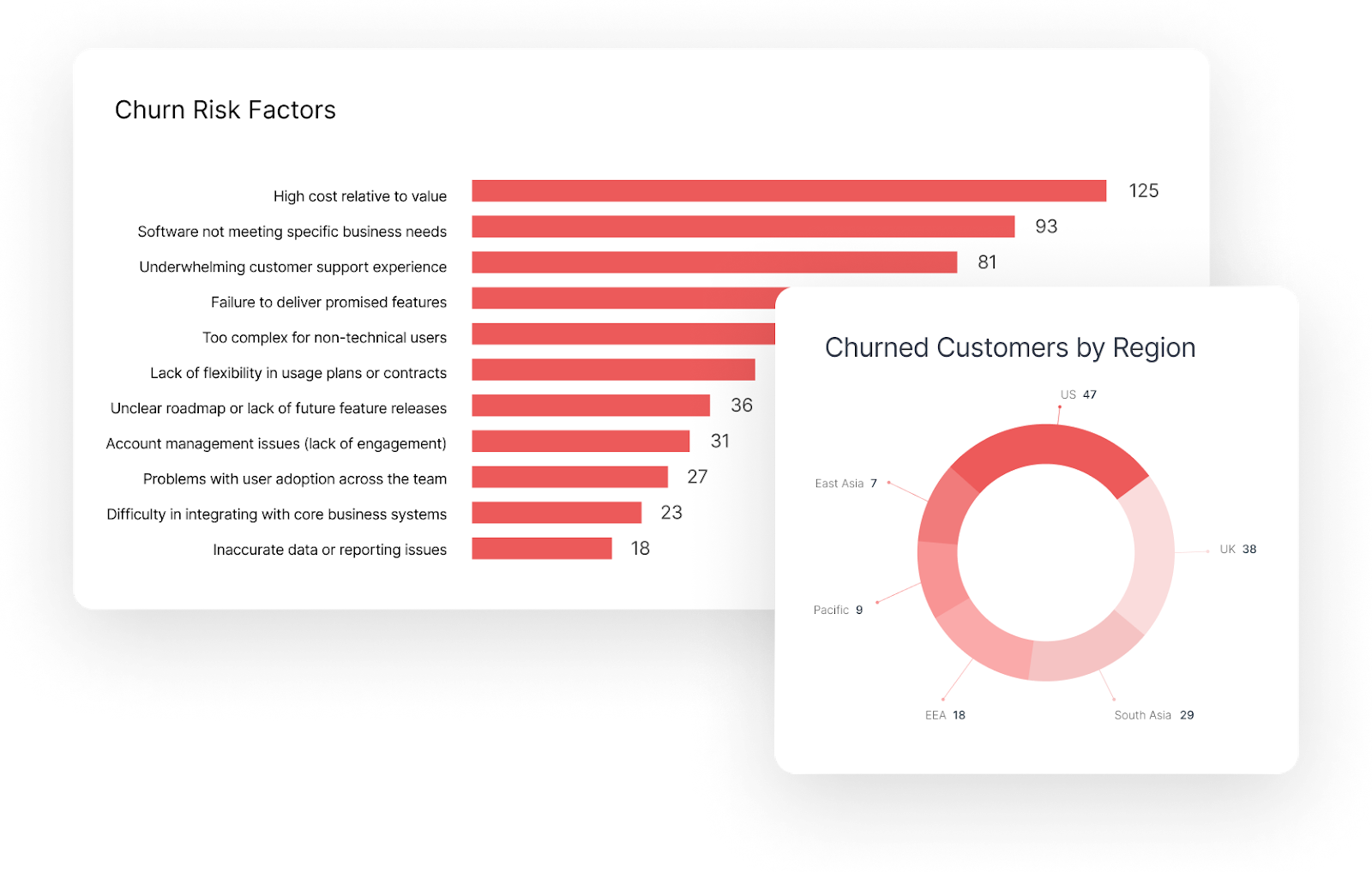
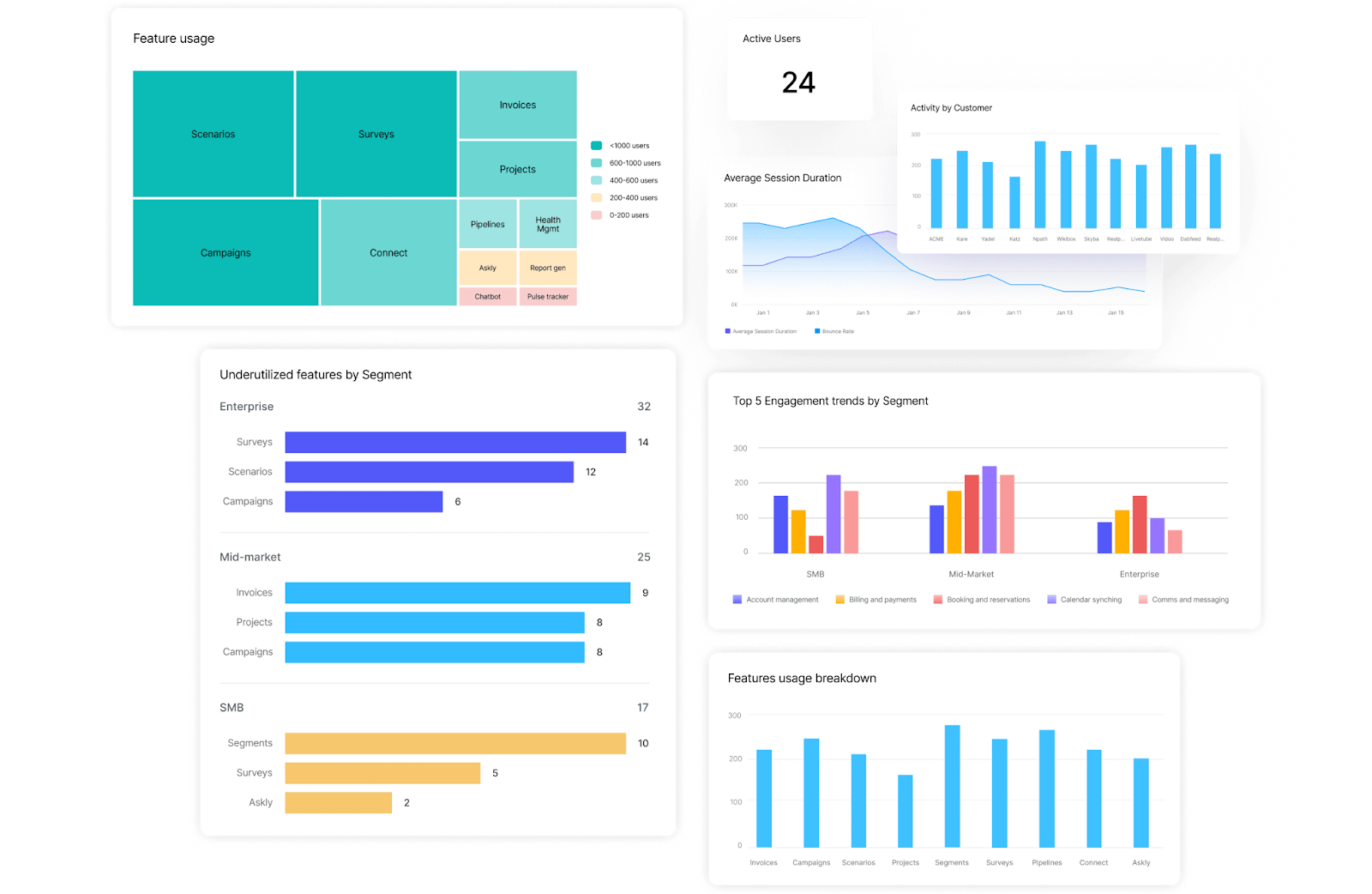
- Feature adoption metrics:
One of the most important elements of an engagement dashboard is feature adoption tracking. This section measures how frequently customers use specific product features and how deeply they incorporate them into their workflows.
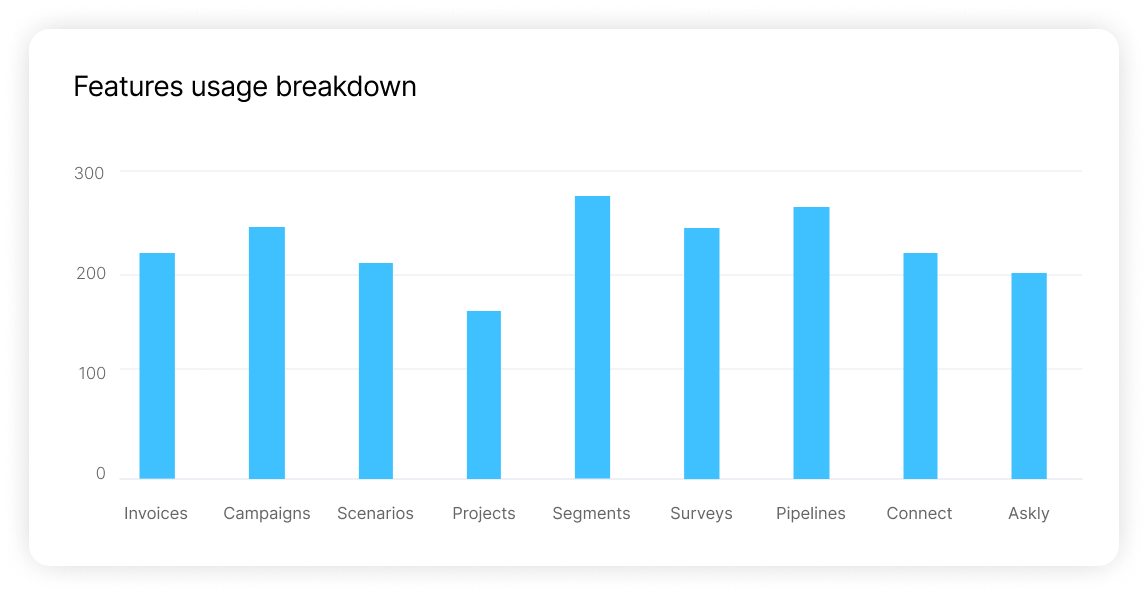
Common metrics include the number of active users per feature, feature usage frequency, session duration tied to specific workflows, and the percentage of accounts adopting key capabilities. These metrics are often visualized through bar charts or tables that show adoption levels across the customer base.
For example, if a core feature designed to drive value is only being used by a small percentage of customers, it signals a potential adoption gap. CSMs can use this insight to launch targeted training sessions, product walkthroughs, or enablement campaigns to improve adoption.
- Engagement trends over time:
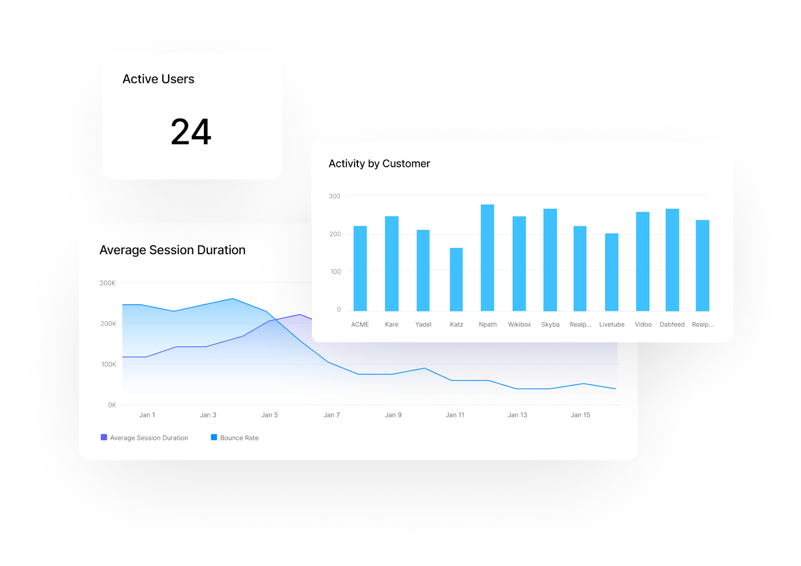
An engagement dashboard should also provide time-based engagement trends to help teams understand how product usage evolves. These trends are typically displayed using line charts that track activity across weeks or months.
Key metrics in this section often include login frequency, number of active users per account, session length, and frequency of interaction with critical product workflows. By tracking these metrics over time, Customer Success teams can detect whether engagement is improving, stabilizing, or gradually declining.
A slow drop in usage can often indicate emerging dissatisfaction or a loss of perceived value. When these patterns are identified early, CSMs can step in with guidance, check-ins, or product recommendations to help customers re-engage.
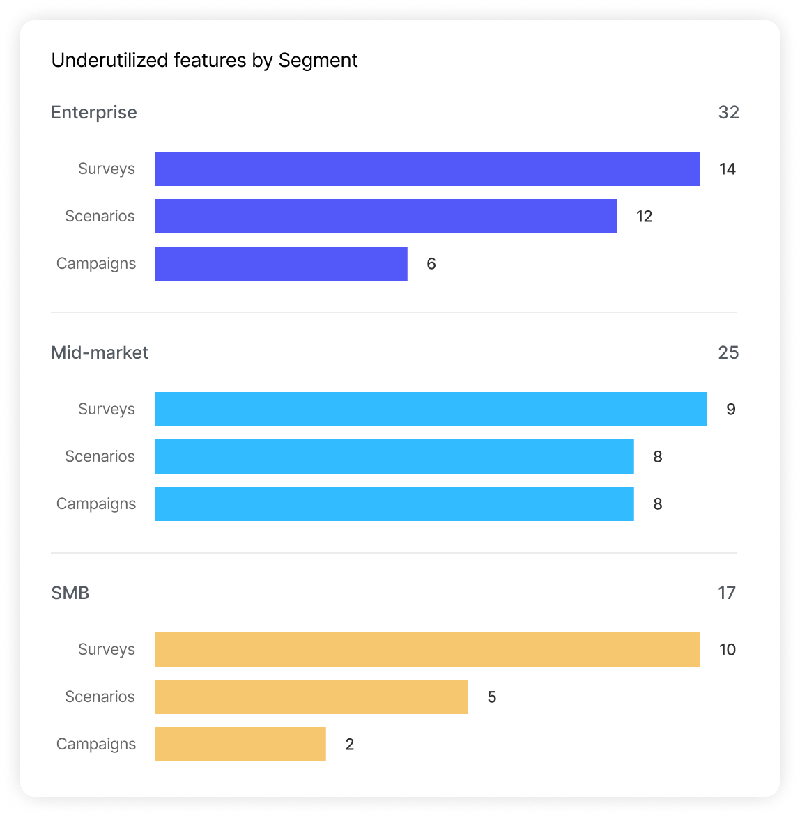
- Underutilized features report:
Even highly engaged customers may only be using a small portion of the product’s capabilities. An underutilized features report highlights areas where adoption remains low, helping teams identify opportunities to increase product value.
This report typically lists features with low usage rates across the customer base and segments that adoption by customer tier, industry, or lifecycle stage.
For instance, if mid-market customers rarely use an advanced analytics feature that enterprise clients rely on heavily, it may indicate that the feature’s value is not being clearly communicated during onboarding or ongoing training.
These insights allow Customer Success teams to develop targeted enablement programs that introduce customers to features they may not yet realize could benefit them.
- Cohort-based usage analysis:
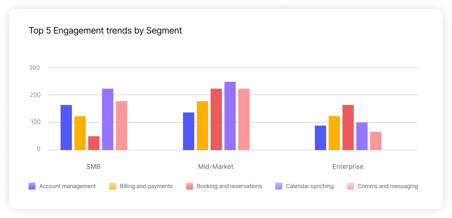
Another useful perspective comes from cohort-based analysis, which compares engagement patterns across different customer groups. Instead of reviewing usage metrics at the individual account level, this analysis looks at trends across segments such as SMB, mid-market, and enterprise customers.
Visual comparisons between cohorts can reveal meaningful patterns. For example, enterprise customers may have higher feature adoption but slower onboarding timelines, while SMB customers may show faster activation but lower long-term engagement.
Understanding these differences allows Customer Success teams to tailor engagement strategies to the needs of each segment, ensuring that resources and guidance are aligned with how different customers actually use the product.
- Heatmap of feature usage:
Feature usage heatmaps provide a quick visual representation of where customers spend the most time within the product. These heatmaps typically highlight which features receive the most interaction and which areas receive little attention.
By visualizing activity density, CSMs can quickly identify which workflows customers rely on the most and which parts of the product may be overlooked.
This information is valuable for both Customer Success and product teams. High-traffic areas often represent features delivering the most value, while low-usage areas may require better documentation, onboarding guidance, or product improvements.

This dashboard can be used to identify opportunities to increase engagement and develop targeted engagement approaches. Strategies like providing educational resources, personalized recommendations, or feature-specific training to boost adoption can be better planned with the information from this dashboard.
Velaris’s advanced analytics and heatmap features make it easy to identify opportunities to drive feature adoption. Additionally, you can automate reports and set up alerts to ensure you stay informed about changing engagement trends.
4. Renewal and upsell dashboard
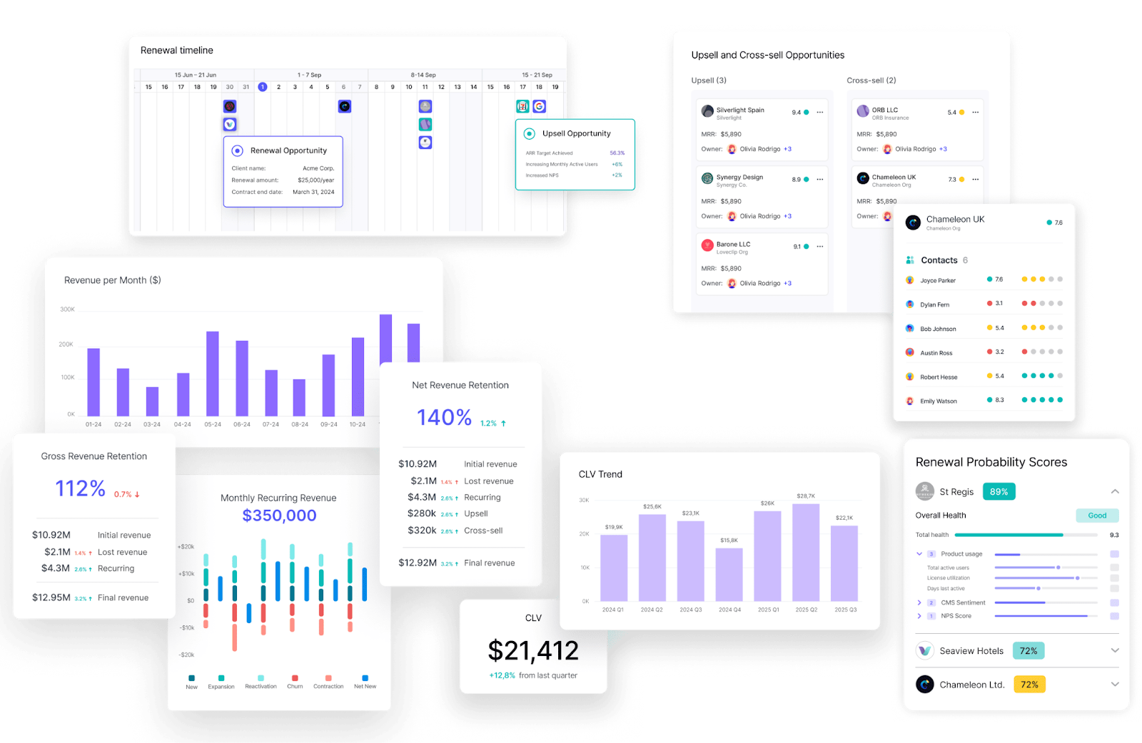
A Renewal and Upsell Dashboard helps Customer Success teams manage one of their most important responsibilities: protecting existing revenue while identifying opportunities for growth. Instead of treating renewals and expansion as isolated activities, this dashboard provides a unified view of retention signals, contract timelines, and account-level growth potential.
By consolidating revenue data, usage insights, and predictive indicators, Customer Success Managers can anticipate renewal outcomes and prepare meaningful expansion conversations well before contracts reach their renewal dates.
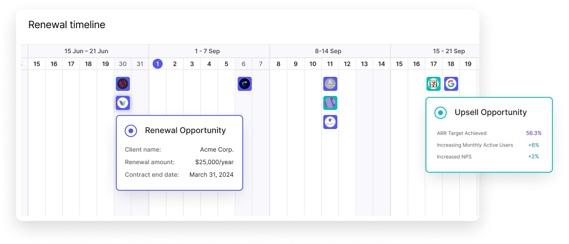
- Contract renewal tracker:
At the center of most renewal dashboards is a contract renewal tracker that displays upcoming renewal dates across the customer portfolio. This is typically presented through a calendar view, timeline, or renewal pipeline that shows which accounts are approaching renewal within specific time windows such as 30, 60, or 90 days.
Alongside renewal dates, the dashboard usually includes additional information such as contract value, renewal stage, assigned owner, and recent engagement activity. This context helps CSMs understand whether accounts are progressing smoothly toward renewal or require intervention.
Having this visibility allows teams to prepare renewal strategies early, schedule strategic check-ins, and avoid last-minute surprises that can jeopardize retention.
Teams managing a high volume of renewals may also benefit from dedicated renewal management software that connects health signals directly to contract timelines and automates key renewal workflows.
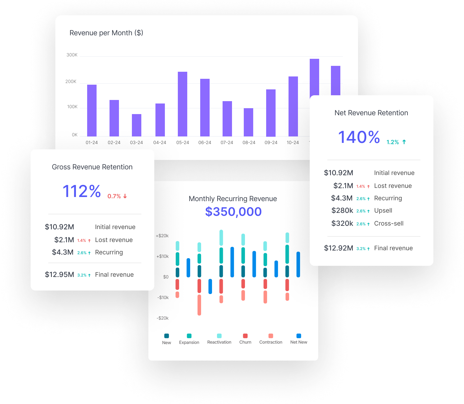
- Net Revenue Retention (NRR) metrics:
Another key element of a renewal dashboard is Net Revenue Retention (NRR), a metric that reflects how effectively a company grows revenue from its existing customer base. NRR accounts for revenue lost from churn and downgrades while also capturing expansion revenue from upsells and cross-sells.
Dashboards often display NRR as a percentage, allowing leadership and Customer Success teams to quickly assess overall account growth performance.
For example, an NRR above 100% indicates that expansion revenue is offsetting churn and driving net growth. Monitoring this metric over time helps teams evaluate whether their retention and expansion strategies are producing sustainable results.
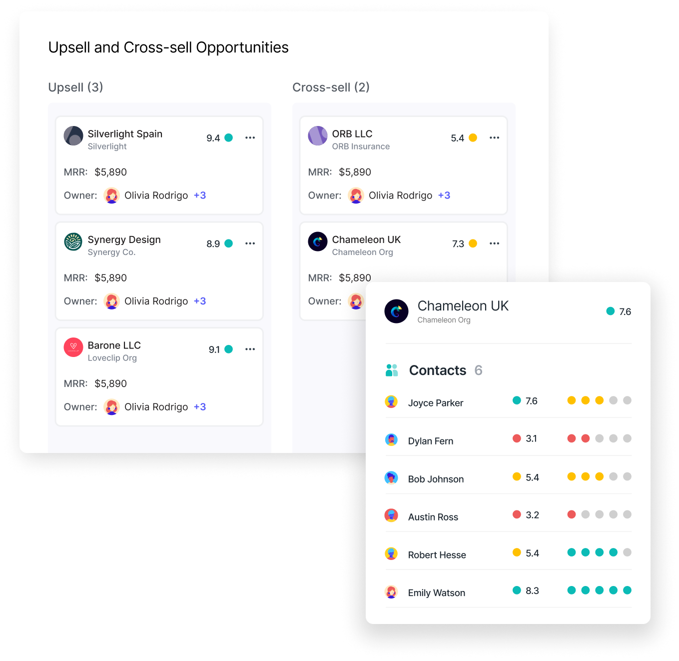
- Upsell and cross-sell opportunities table:
A renewal and upsell dashboard also highlights accounts with expansion potential. These opportunities are often identified by analyzing product usage patterns, feature adoption, customer feedback, and lifecycle milestones.
For instance, accounts that have reached high adoption levels, added more users, or expressed interest in additional capabilities may be strong candidates for upsell conversations.
Dashboards typically present these opportunities in structured tables that include details such as account value, product usage indicators, expansion potential, and estimated revenue impact. This allows Customer Success teams to prioritize expansion efforts and coordinate closely with sales or account management teams.
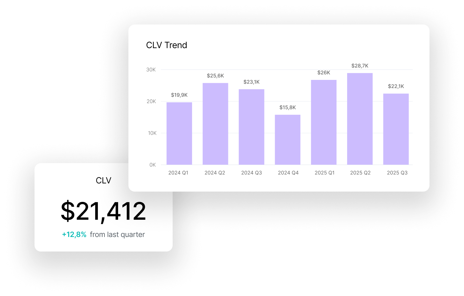
- Customer Lifetime Value (CLV) insights:
Another important component is Customer Lifetime Value (CLV) analysis. CLV measures the total revenue a customer is expected to generate throughout their relationship with the company, making it a useful indicator of long-term account importance.
In a renewal dashboard, CLV is often visualized through charts or segmented tables that highlight high-value accounts across the portfolio. This allows teams to focus strategic attention on customers with the greatest long-term revenue potential.
For example, a high CLV account approaching renewal may warrant a more strategic conversation about expansion, partnership alignment, or long-term success planning.
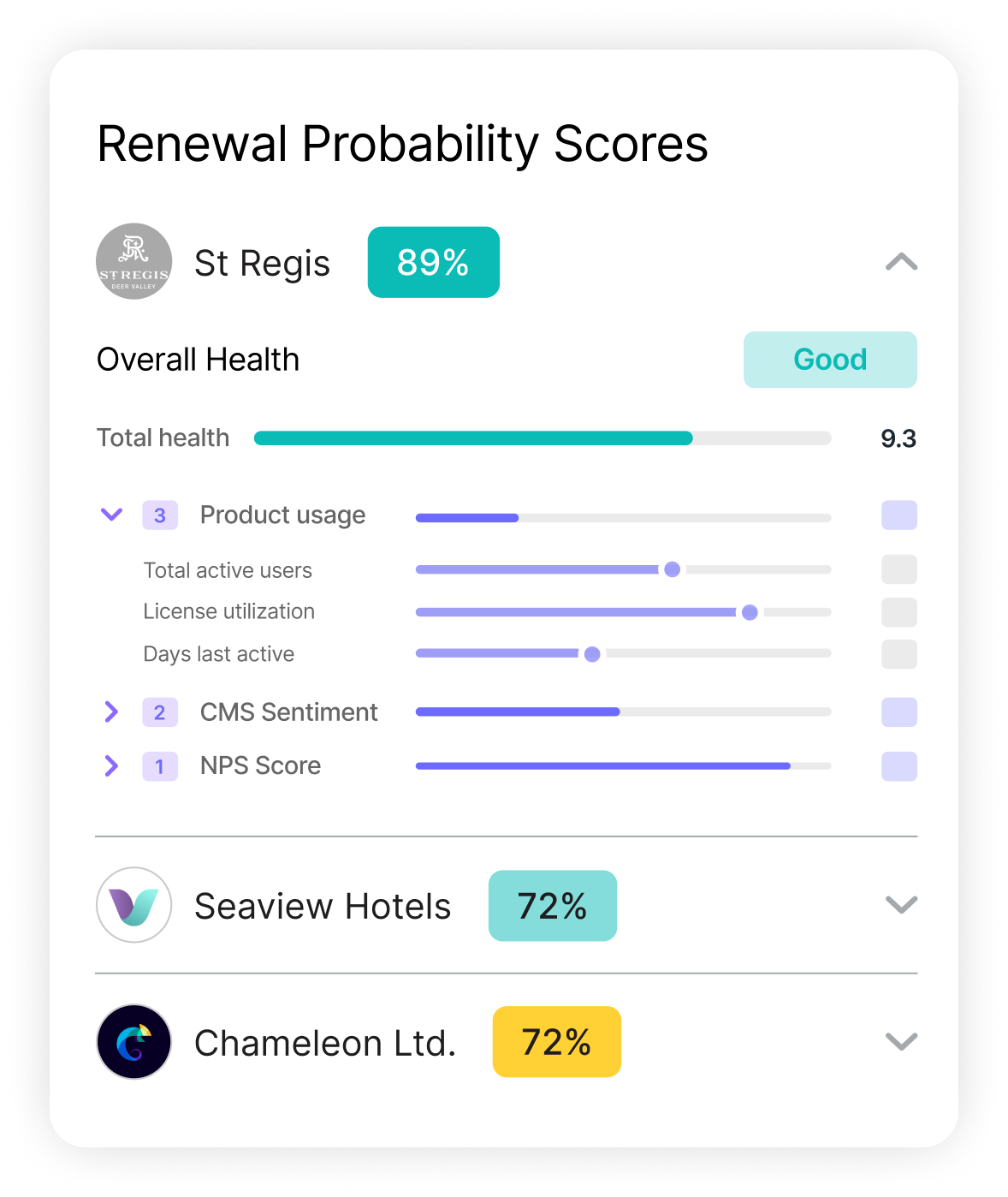
- Renewal probability scores:
Advanced renewal dashboards also incorporate renewal probability scores that estimate the likelihood of a customer renewing their contract. These predictive indicators are usually based on a combination of behavioral signals, engagement patterns, and historical account data.
Common factors contributing to renewal probability include product adoption trends, recent engagement levels, support ticket history, sentiment signals, and customer health scores.
By presenting these signals together, the dashboard helps CSMs identify accounts that may require proactive attention well before the renewal window. For example, a customer with declining usage and negative sentiment signals may show a lower renewal probability, prompting early intervention to address potential concerns.
Renewal reminders and alerts help ensure that no critical timelines are missed, while detailed customer insights enable CSMs to have meaningful conversations with clients about expanding their partnership. The ability to track customer sentiment alongside financial data also helps identify and address at-risk accounts before renewal discussions.
Velaris streamlines renewal and upsell management by providing a centralized dashboard for tracking contract dates, revenue metrics, and upsell opportunities. Its predictive analytics tools also allow you to assess renewal probabilities and CLV.
5. Support interaction dashboard
A Support Interaction Dashboard provides Customer Success and support teams with visibility into how customers interact with support channels and how effectively issues are being resolved. Since support experiences strongly influence customer satisfaction and retention, this dashboard helps teams monitor both the quality and efficiency of customer support operations.
By tracking ticket trends, response performance, and customer sentiment in one place, teams can identify recurring problems, improve support workflows, and ensure customers receive timely assistance.
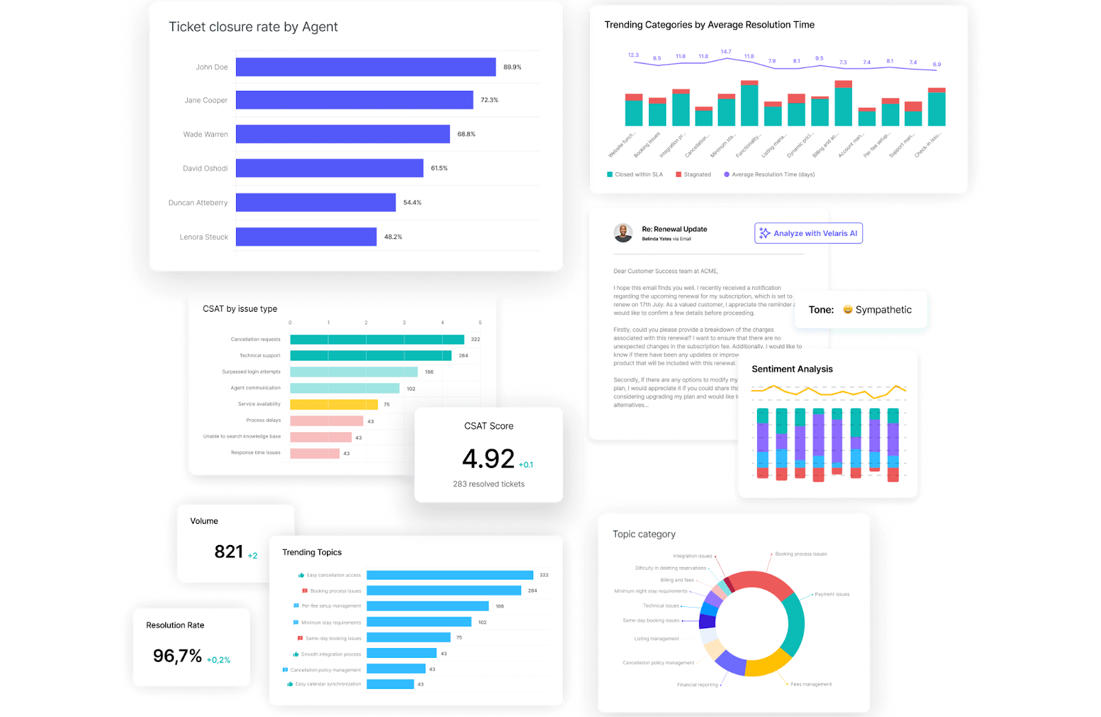
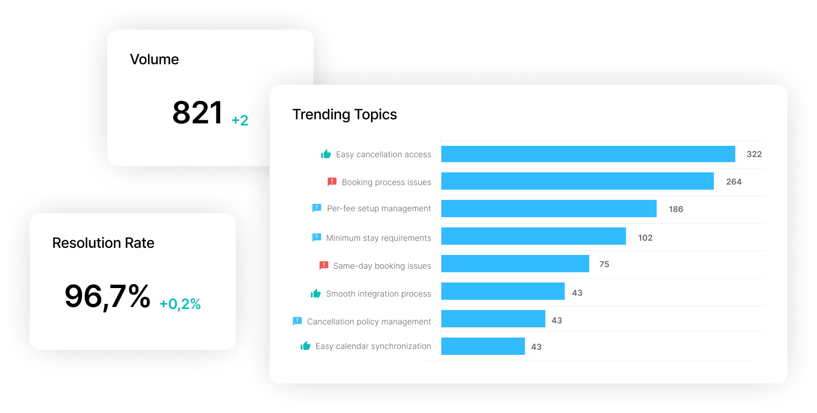
- Ticket volume and trends:
One of the most important elements of a support dashboard is ticket volume tracking. This section typically visualizes the number of support requests submitted over time using line charts or bar graphs.
Tickets are often segmented by priority level, issue category, or support channel. For example, teams might track high-priority incidents separately from routine questions or compare tickets submitted via chat, email, or help center forms.
Monitoring ticket trends helps teams quickly identify spikes in support demand. A sudden increase in tickets related to a specific feature or workflow may signal a product bug, a confusing interface change, or gaps in documentation that need immediate attention.
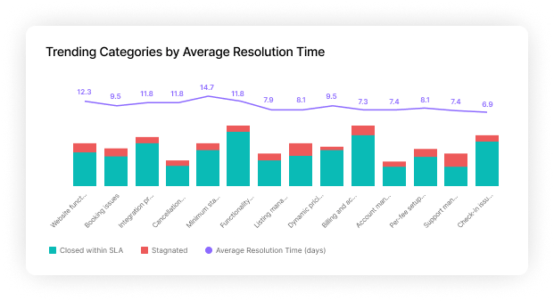
- Resolution time metrics:
Another critical metric for support dashboards is resolution time. This measures how quickly customer issues are resolved after they are submitted.
Key metrics often tracked in this section include:
- Average time to first response
- Average resolution time per ticket
- Resolution time by priority level
- Resolution time by support tier or escalation stage
By analyzing these metrics, teams can determine whether critical issues are being handled quickly and whether service level agreements (SLAs) are being met. Delays in resolving high-priority tickets can negatively impact customer satisfaction, making this metric essential for maintaining a strong support experience.
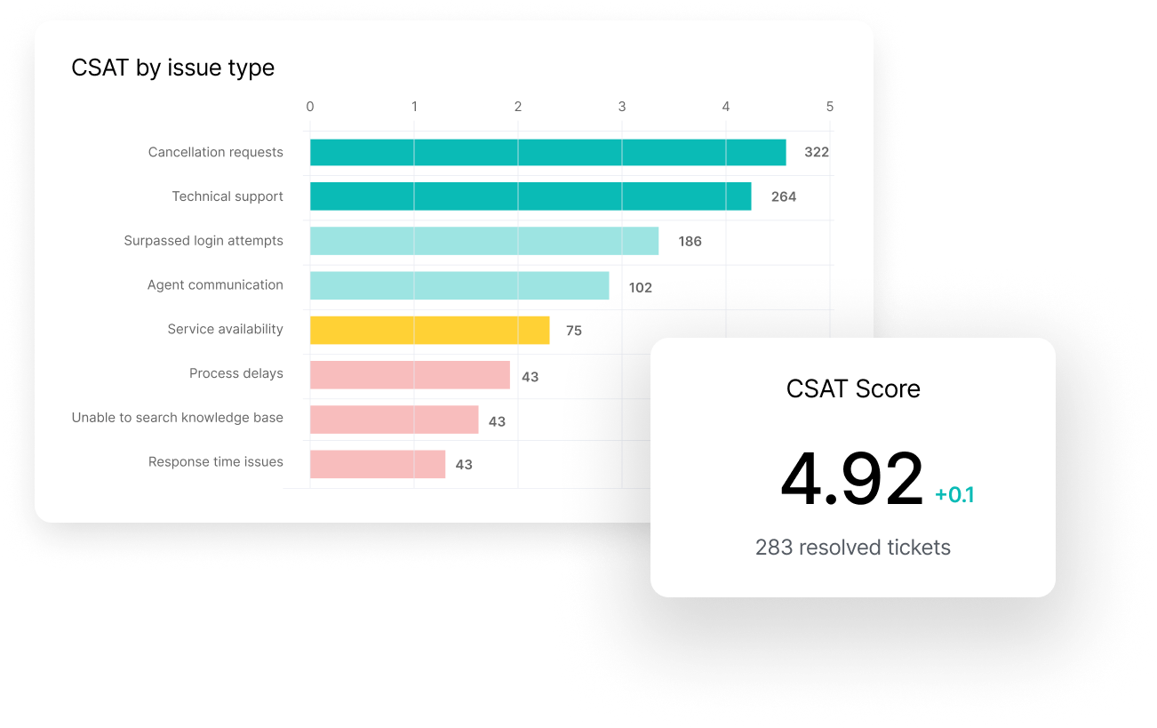
- Customer Satisfaction (CSAT) Scores:
Support dashboards also track Customer Satisfaction (CSAT) scores collected after support interactions are completed. Customers typically provide feedback through short surveys or rating systems that appear once a ticket has been resolved.
These scores are often displayed as a single aggregate metric, but they can also be segmented by support agent, issue category, or customer segment. For example, teams might compare satisfaction levels between onboarding-related support tickets and technical bug reports.
Tracking CSAT over time helps Customer Success teams understand whether support interactions are meeting customer expectations and whether changes in support processes are improving or harming the customer experience.
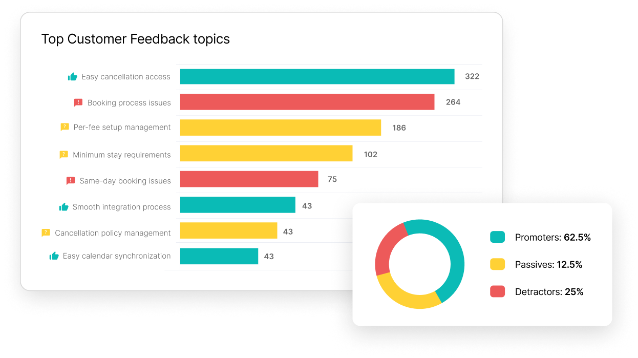
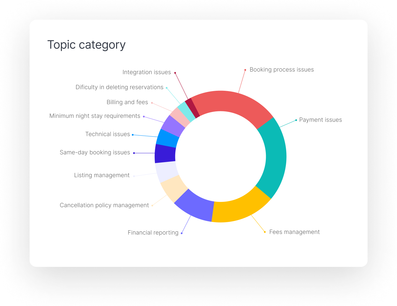
- Recurring issue analysis:
A useful support dashboard also highlights recurring support issues. This analysis categorizes support tickets by topic, such as product bugs, configuration issues, onboarding questions, or feature requests.
Visualizations such as pie charts or category tables help teams identify which types of issues appear most frequently. If a large percentage of tickets relate to the same workflow or product feature, it may indicate that customers are struggling with that area of the product.
These insights can guide both Customer Success and product teams. Documentation can be improved, onboarding content can be updated, or product teams can prioritize feature improvements to eliminate recurring friction.
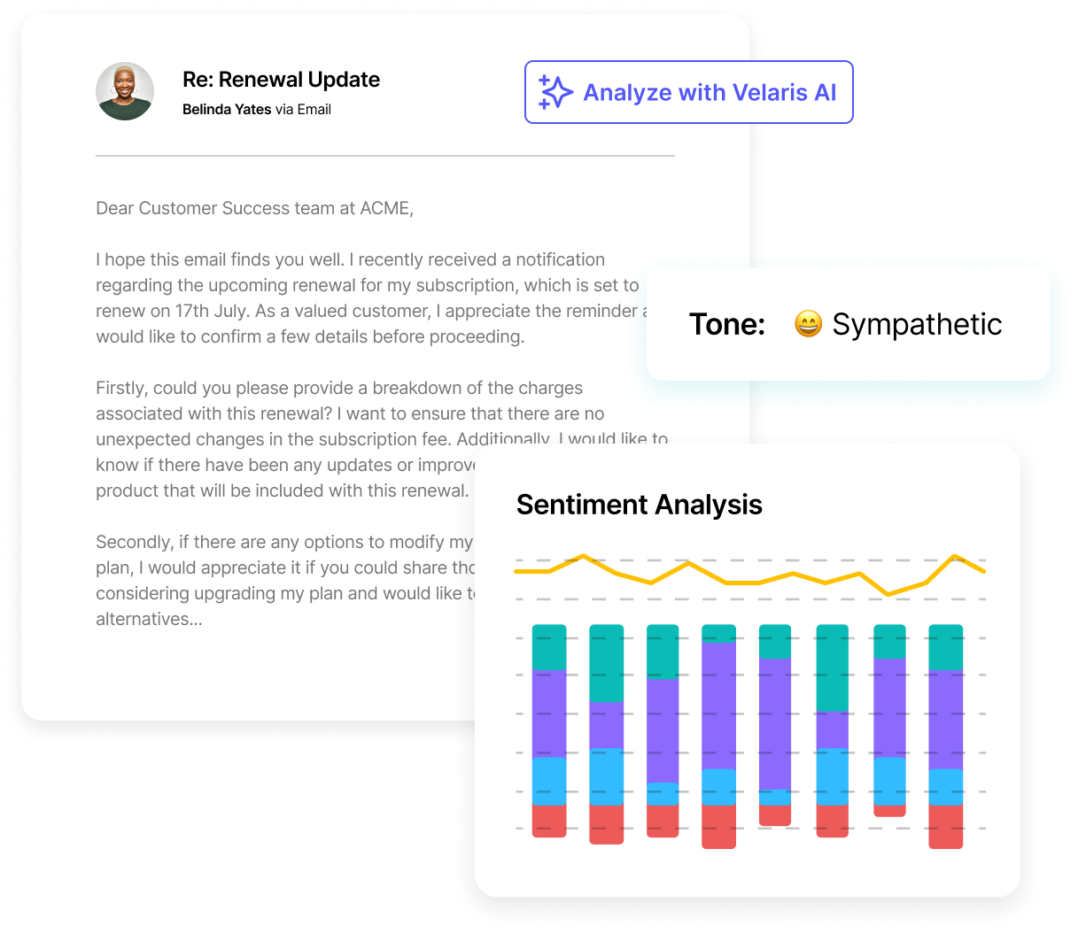
- Sentiment analysis of interactions:
Beyond ticket counts and resolution metrics, many dashboards also incorporate sentiment analysis of customer conversations. Natural language processing tools can analyze support interactions to determine whether customer tone is positive, neutral, or negative.
This analysis provides deeper insight into customer satisfaction than numerical ratings alone. For example, even if a ticket is resolved quickly, negative sentiment within the conversation may indicate frustration with the product experience.
Tracking sentiment across support interactions helps Customer Success teams identify accounts that may require proactive follow-up or additional support.
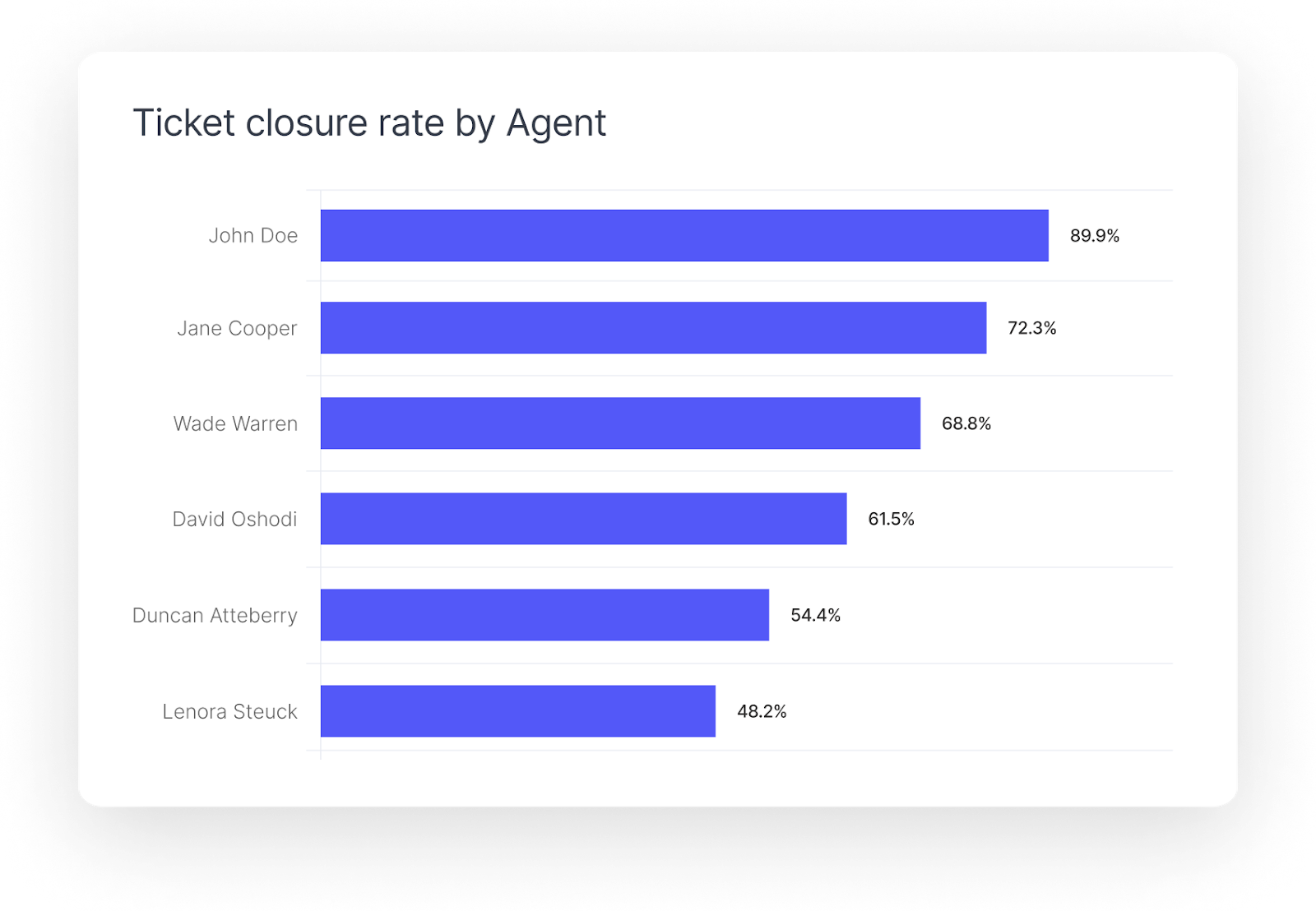
- Agent performance metrics:
Finally, support dashboards can include agent performance metrics to help teams understand how effectively support staff are handling customer requests.
These metrics may include average resolution time per agent, ticket closure rates, number of tickets handled, and customer satisfaction scores associated with each support representative.
By reviewing these metrics, support leaders can identify top-performing agents, detect potential training opportunities, and ensure that workloads are distributed effectively across the team.
Using this dashboard can give you deeper insights into customer satisfaction levels, allowing CSMs to understand not only what issues customers are facing but also how those issues are impacting their experience.
These dashboards work together to provide a comprehensive toolkit for CSMs, enabling them to manage customer relationships proactively, deliver value efficiently, and uncover growth opportunities while ensuring customer satisfaction and long-term loyalty.
How to build customer success dashboards in Velaris
Velaris enables effective Customer Success by combining product usage data, lifecycle visibility, and Voice of Customer (VoC) insights into unified dashboards that help Customer Success teams act earlier and with more context.
Centralize customer data with the Customer View
The first step in building a Customer Success dashboard in Velaris is consolidating customer information into a single workspace. Velaris’ Customer View aggregates data from multiple sources such as CRM systems, support tools, product analytics platforms, and communication channels.
This centralized view allows dashboards to pull together metrics like product usage trends, lifecycle stage progression, account value, and recent customer interactions. Instead of switching between multiple tools, CSMs can monitor the full customer picture from one place.
When this data is unified, dashboards become far more useful because every metric can be interpreted within the broader context of the customer relationship.
Track operational and lifecycle metrics
Velaris dashboards allow teams to visualize operational metrics that reflect the overall health and progression of customer accounts. These dashboards typically track metrics such as:
- Customer health scores
- Product adoption and feature usage
- Onboarding milestone completion
- Renewal timelines and revenue indicators
- Support ticket activity and engagement levels
These metrics can be displayed through charts, tables, and trend visualizations that help Customer Success teams quickly identify patterns across their portfolio.
For example, a CSM might notice that accounts with low feature adoption also show declining engagement and rising support tickets. Seeing these signals together helps teams identify risks earlier and intervene before churn becomes likely.
Incorporate Voice of Customer (VoC) insights
While usage data is essential, it does not always explain how customers actually feel about their experience. This is where Voice of Customer (VoC) analysis becomes valuable.
Velaris dashboards allow teams to incorporate feedback signals from sources such as support conversations, surveys, emails, and customer calls. By analyzing these interactions, the platform can surface sentiment trends and qualitative insights that provide deeper context behind customer behavior.
For example, sentiment analysis can reveal whether conversations are trending positive, neutral, or negative across different accounts or segments. When combined with engagement data, this allows Customer Success teams to identify customers who may appear healthy based on usage but are expressing frustration in conversations.
Analyze sentiment and qualitative signals
Velaris also enables teams to analyze qualitative customer data at scale. Instead of manually reviewing support tickets or customer calls, AI-powered analysis can categorize conversations by topic, sentiment, and recurring themes.
Dashboards can then visualize these insights through reports such as:
- Sentiment trends across accounts or segments
- Common topics raised in customer conversations
- Emerging issues related to specific features or workflows
- Frequency of specific customer concerns over time
These insights help Customer Success teams move beyond surface-level metrics and understand the underlying reasons behind customer behavior.
For example, if sentiment analysis reveals repeated frustration around onboarding workflows, teams can update onboarding playbooks or documentation to address the root cause.
Turn insights into proactive action
The real value of Customer Success dashboards lies in how they inform action. Velaris dashboards connect insights directly to workflows, making it easier for teams to respond when risk signals appear.
For instance, if sentiment trends decline for a high-value account or product usage drops significantly, workflows can trigger tasks, alerts, or follow-up actions for the assigned CSM. This ensures that signals surfaced in dashboards translate into proactive customer engagement.
To learn more about best practices for building Customer Success Dashboard, see our guide here.
Conclusion
Customer Success dashboards are essential tools for CSMs, providing a consolidated view of key metrics that drive customer satisfaction and business growth.
By tracking metrics like customer health score, churn rate, customer lifetime value (CLTV), net promoter score (NPS), and product usage, Customer Success Managers can make informed decisions and proactively manage customer relationships.
Effective dashboards align metrics with business goals, use integrated Customer Success software like Velaris, a highly rated software on G2, and offer intuitive design and real-time insights.
Book a demo today to explore Velaris and see how it can help you build an effective Customer Success dashboard, streamline your processes, and drive Customer Success.
Frequently Asked Questions
What is a Customer Success dashboard?
A Customer Success dashboard is a centralized interface that displays key metrics related to customer health, engagement, adoption, and retention. It helps Customer Success Managers quickly understand how accounts are performing and identify risks or growth opportunities.
What metrics should a Customer Success dashboard include?
Common metrics include customer health scores, product usage trends, feature adoption rates, churn risk indicators, onboarding progress, renewal timelines, and customer satisfaction scores such as NPS or CSAT. Many teams also include sentiment and support interaction data for deeper context.
How often should Customer Success dashboards be reviewed?
Most teams review dashboards daily or weekly to monitor account health and engagement trends. Strategic dashboards related to renewals, expansion, or long-term performance are often reviewed during monthly or quarterly planning cycles.
Can dashboards include customer sentiment and qualitative insights?
Yes. Modern Customer Success platforms can analyze customer conversations, surveys, and support interactions to capture sentiment and qualitative feedback. These insights complement quantitative metrics and help teams understand the underlying reasons behind customer behavior.
The Velaris Team
A (our) team with years of experience in Customer Success have come together to redefine CS with Velaris. One platform, limitless Success.

Velaris is an AI-native Customer Success Platform built for mid-market and enterprise B2B SaaS teams. From customer health scoring and churn prediction to onboarding automation, renewals, and expansion workflows, Velaris helps recurring revenue teams understand account health, reduce churn, and scale customer success with greater visibility and control.